One of my favorite free contact form plugins for WordPress is Contact Form 7. It’s easy to use but also has a lot of features, it can handle file uploads, and you can create multiple forms, if you need more than one on your website.
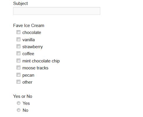
On many themes, however, the checkboxes and radio buttons don’t line up properly when there are a lot of choices and are displayed horizontally rather than vertically.
The checkbox selections look like the following:
There is, however, a simple CSS fix for this.
Paste the following into the stylesheet for your theme. It is located at Appearance > Editor > style.css
span.wpcf7-list-item {
display:block;
}
The checkbox and radio button selections will then look like this:
Do you use a contact form on your site? Which one do you use? Do you like Contact Form 7?
photo credit: 22658750@N02


Great option to use,
We can make our blog post much more attractive with this nice option.
Thanks – I’m glad it helped.
I’ve had issues in the past with updates on a previous contact form that I used to use. Ever since though I switched to ‘Fast Secure Contact Form’ and everything has been smooth and good!
-Jean
Thanks for the recommendation – I haven’t tried that one.
thank you very much, and I had his head broke as me make it vertical)) Super
Is there a specific area where this code should be inserted on the Theme Editor > style.css page? I wonder if that’s why nothing has changed for me.
In my case, I have a listing okay, but the space between my check box and the text is around 25 spaces, unlike your example above where it is nicely shown at perhaps 2 spaces, as it should be.
Much appreciated if you can help.